INFO
MuirStock is an annual festival held by Muir College at the University of California, San Diego. Witha. sucessful revival, I continued to elevate the creative direction of the event with a new look,
MY ROLE
Muirstock Director
TIMELINE
September 2023 – April 2023
TEAM
1 Internal Staff · 7 Interns · 1 Chair
TOOLS

Adobe CC · Instagram · Figma· Canva· Procreate
View my Visual Design 2022-23
⇩ LEARN MORE ⇩
The Challenge
Keeping the momentum and building on the previous year to evolve Muirstock for it's second year after its revival.
The Solution
To evolve Muirstock in its second year, we treated the event as a fully designed world. The programming, space, and communication all carried a unified visual identity.
01 RESEARCH AND FINDINGS
Listening to our Community
The 2022-23 post-event evaluation surveys gave us a clear baseline for what students wanted to see the follow year. The feeback established early expectations around genre, energy, and overall tone effectively setting us up for success before planning even began. We had 111 responses come from our google survey that not only resulted in the two genres we have below but also gave us even more direction on 2023-24 Muirstock merch, venue, and artist selection.
SURVEY SURVEY SURVEY SURVEY SURVEY
SURVEY SURVEY SURVEY SURVEY SURVEY
Rap
Latin
02 Exploring color. texture, and feel
Creating the Visual World
Because some team members were new to both figma and creating a moodboard, their contirbutions reflect intuitive preference. Some leaned straight merch exploration, wanting to tackle the look and feel, while others centered their attention around how the concert should feel visualy pointing out elments they were drawn to.
Knowing the direction we had gone in prior, I wanted to push the extremes and re-interpret its scale, spirit, and cultural impact for a completely different genre. We imagined a new feel that re-flavored how community, independence, and musical expression could look through high-saturation, Vinyl textures, and bold text choices.

Curated, not created — all references pulled externally for mood and direction.
2.A | Final colors
Color
Palette
Given that the color palette from our modboard varied I refined our palette because we sought to make even more merch for this event and did not want to limit the color palette similar to 2022-23 for our new add-ons. Not all the colors were used for the main marketing deliverables either but just meant to expand my team's options.
COLOR PALETTE
#DDFF56
#F70B86
#BB91FF
#FF5346
#ADDE7A
#246885
#951C65
#172B03
#280160
#FFFFFF
TYPOGRAPHY
BODY / SUBTEXT
ERIC MACHAT HEADLINE
ERIC MACHAT
DISPLAY / HEADERS


EPSTEIN FAMILY AMPHITHEATER
MARCH 9TH 2024
2.B new themes goodies
From Identity to Experience











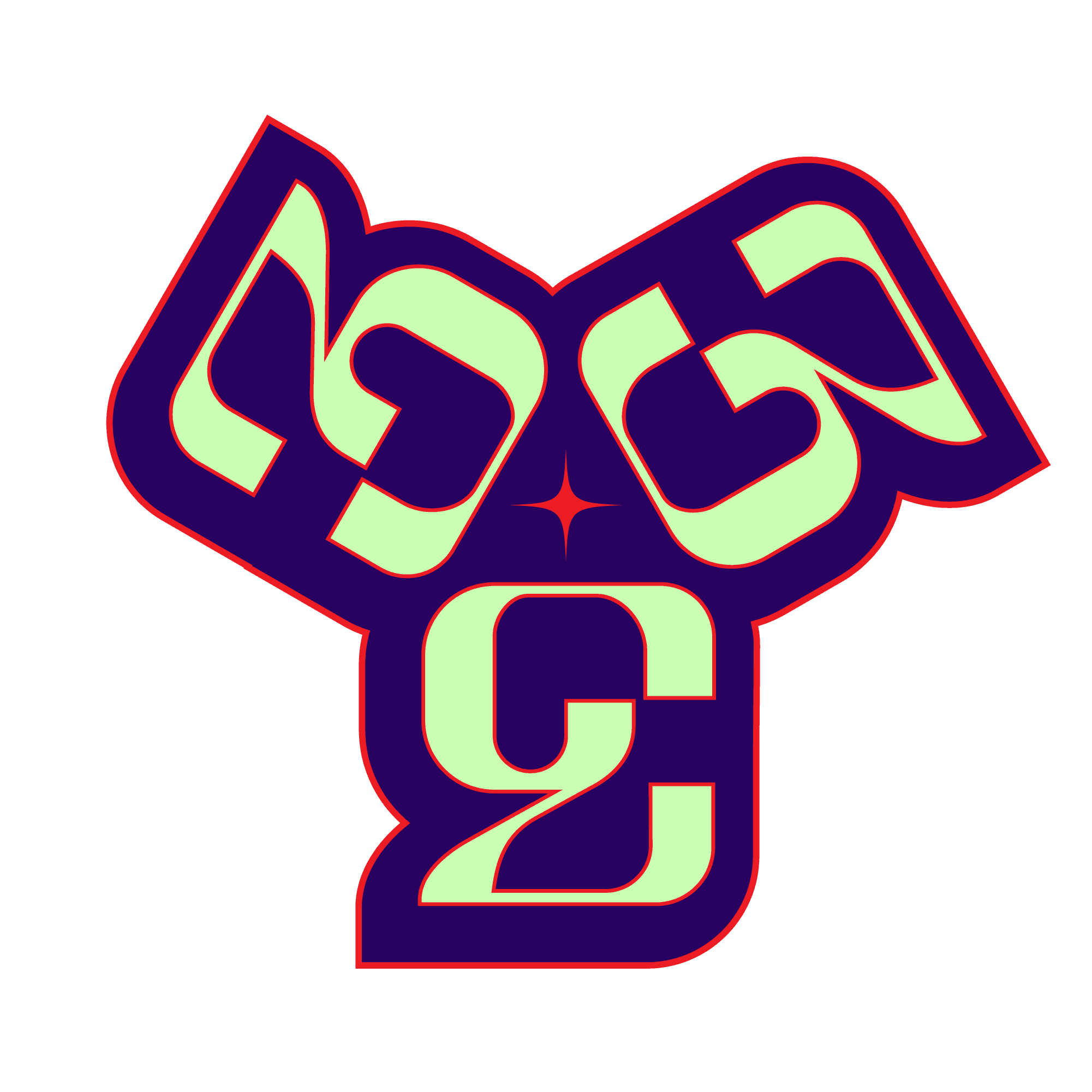
Merch Design
28005F
PMS 2765
C9FFB4
PMS 358
EC1C24
PLATING OUTLINE

ITERATION #1
ITERATION #2

FINAL #1

FINAL #2

TOTE ITERATION #1

TOTE ITERATION #2
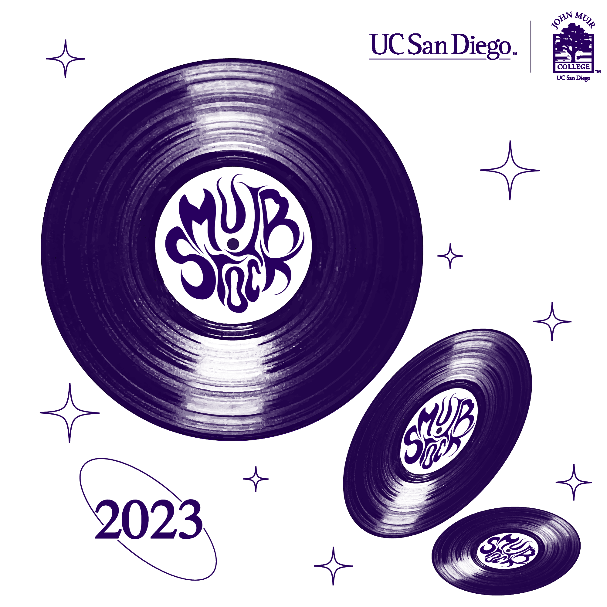
TOTE FINAL #1
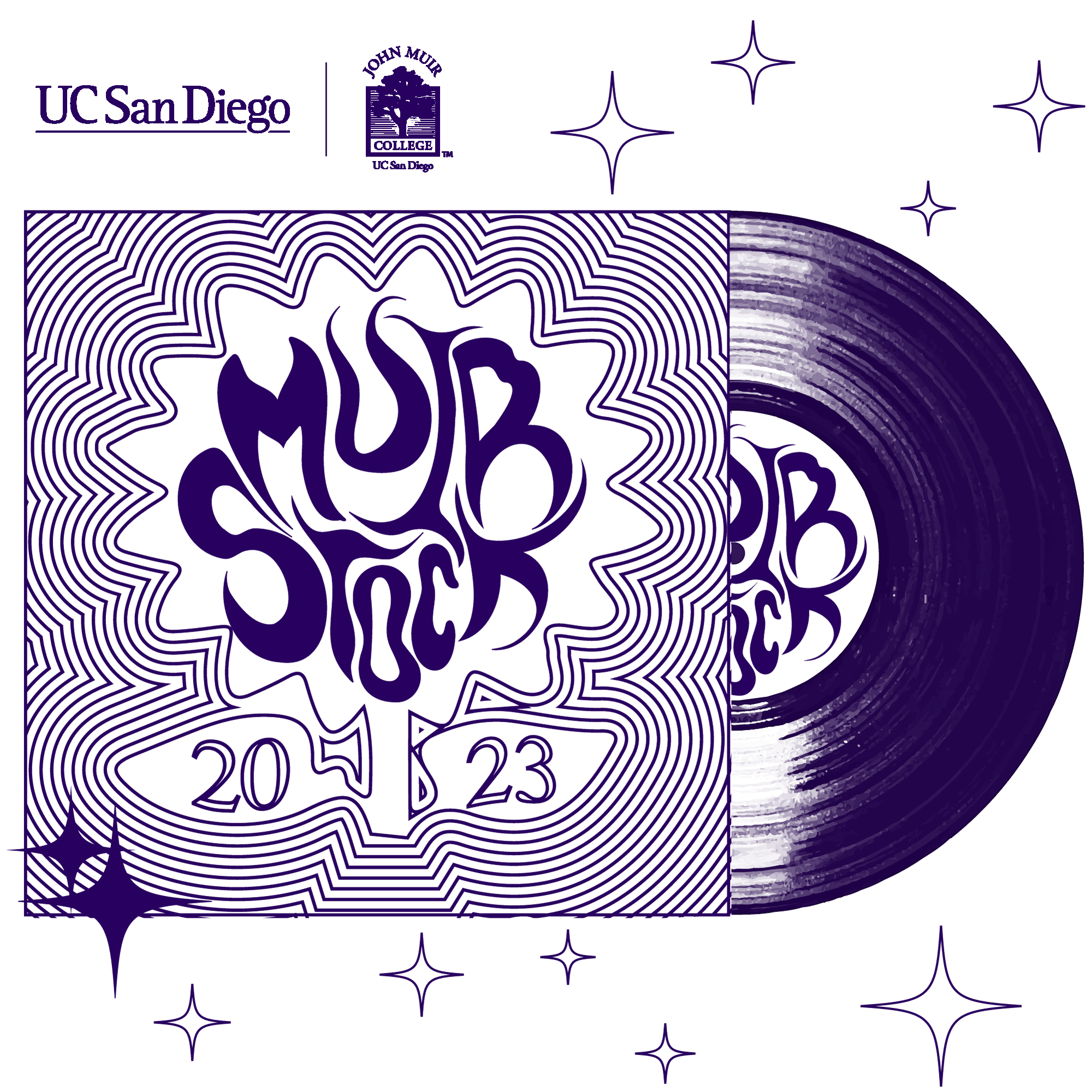
TOTE FINAL #2
Beyond the design, I made the deliberate decision for the product itself with my manager. Most event merch tote bags were single-use throwaways that were flimsy enough to get discarded after one week. I ensured that the MuirStock tote bag was heavy duty canvas, built for repeated use. The goal was for it to become a campus staple that students would favor for running errands, not just something to be stuffed in a drawer. Functional, durable, and intentional to actually be seen leaving a lasting impression as many sought to get one and resulted in ongoing organic promotion.
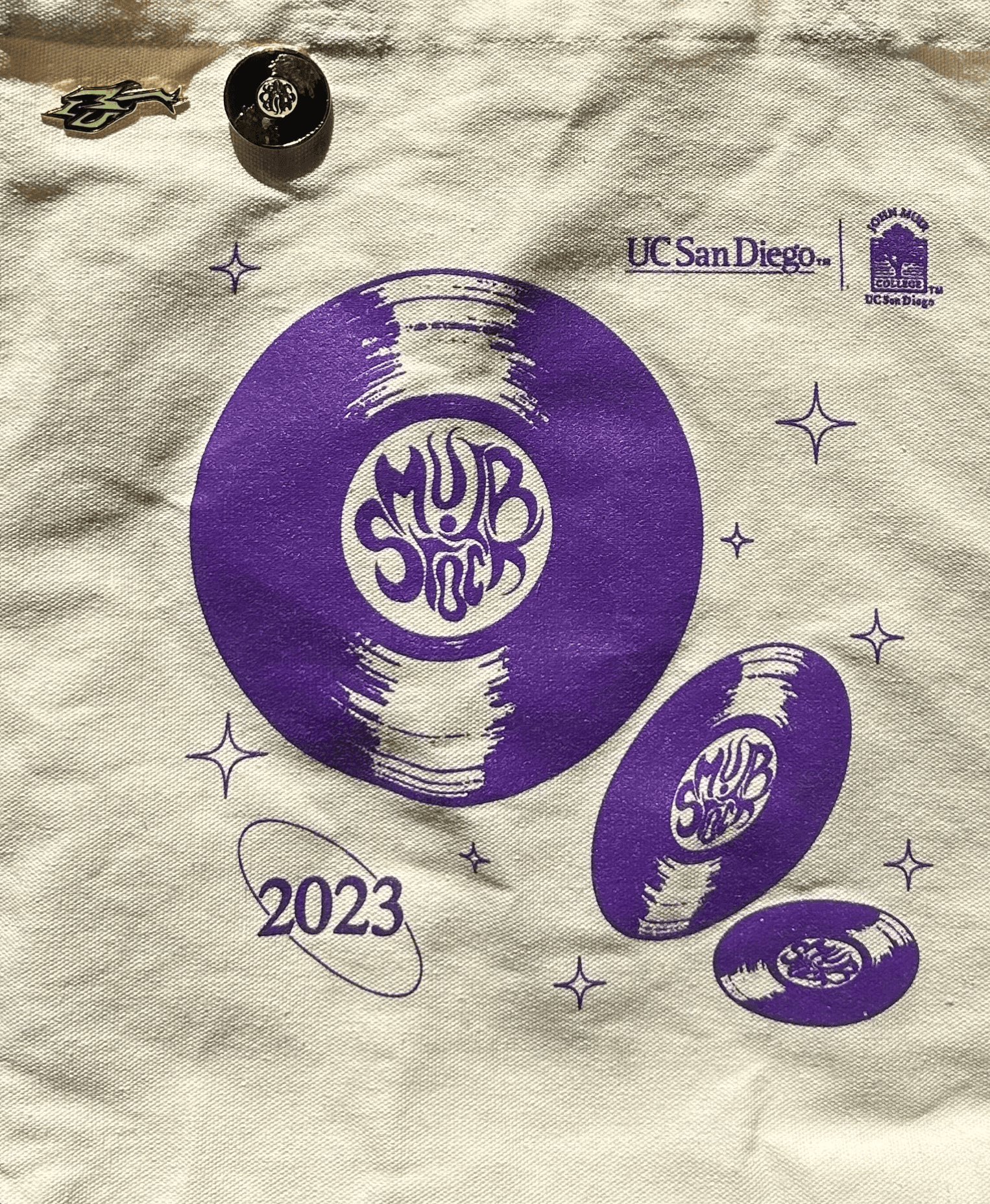
CLOSE UP ON PINS AND DESIGN #1

DESIGN #2
03 THE DROP
THE COUNTDOWN
With everything set in place, we needed to build traction for the event. I developed a marketing plan that was executed in phases teasers, artist announcement, event info, and content the day of. The goal was passive buzz and word of mouth.
THE PLAN
Every post was launched using Later, helping to build momentum appropriately toward April 13. We started with an infographic about Muirstock to help lead into teasing location and date before dropping any information on the actual artist.
The choice to drop merch was incentive for filling our venue while at the same time reaping engagement to show the opener.

These were the story teasers posted after our infographic about what Muirstock is. These were approved by artist's agents as they wanted to approve of their artists overall representation even within the teaser launch, hence why they both aren't carrying audio. Granted, these had our audience hooked which allowed for the remaining drops to be even more seamless for the weeks to come. Alongside these story posts, Celebrating Muir College Week is the week long of festivities leading up to Muirstock that also required marketing.
Joyce Wrice Teaser
Joyce Wrice Teaser

Tinashe Teaser

Joyce Wrice Teaser

Joyce Wrice Teaser
Tinashe Teaser


04 A dancing Future
FULL VOLUME
At the peak of student life and campus engagment being so detached, this concert healed many students who sought to experience music on campus they resonated with. From the usual slow pace events or rave based concerts, this truly embodied the spirit of not only what MuirStock stands for as the first music festival for the University of California, San Diego but truly changed the trajectory of many other events for the following years.
Seeing it all come together was the moment I understood what it means to design something that makes people feel seen and truly know how design can deliver an experience like no other. This could have not been done without


Muirstock / case study / 2023-24
Siul Maduena